Redesigning Dooger - A User-Centric Overhaul for Improved Engagement
Dooger is an e-commerce platform specializing in dog training apparel. However, the original website suffered from significant usability and design flaws that impacted its core functionality and user engagement.
TIMELINE
3 months
PLATFORM
Website
MY ROLE
UI/UX Designer
Work type
Freelance

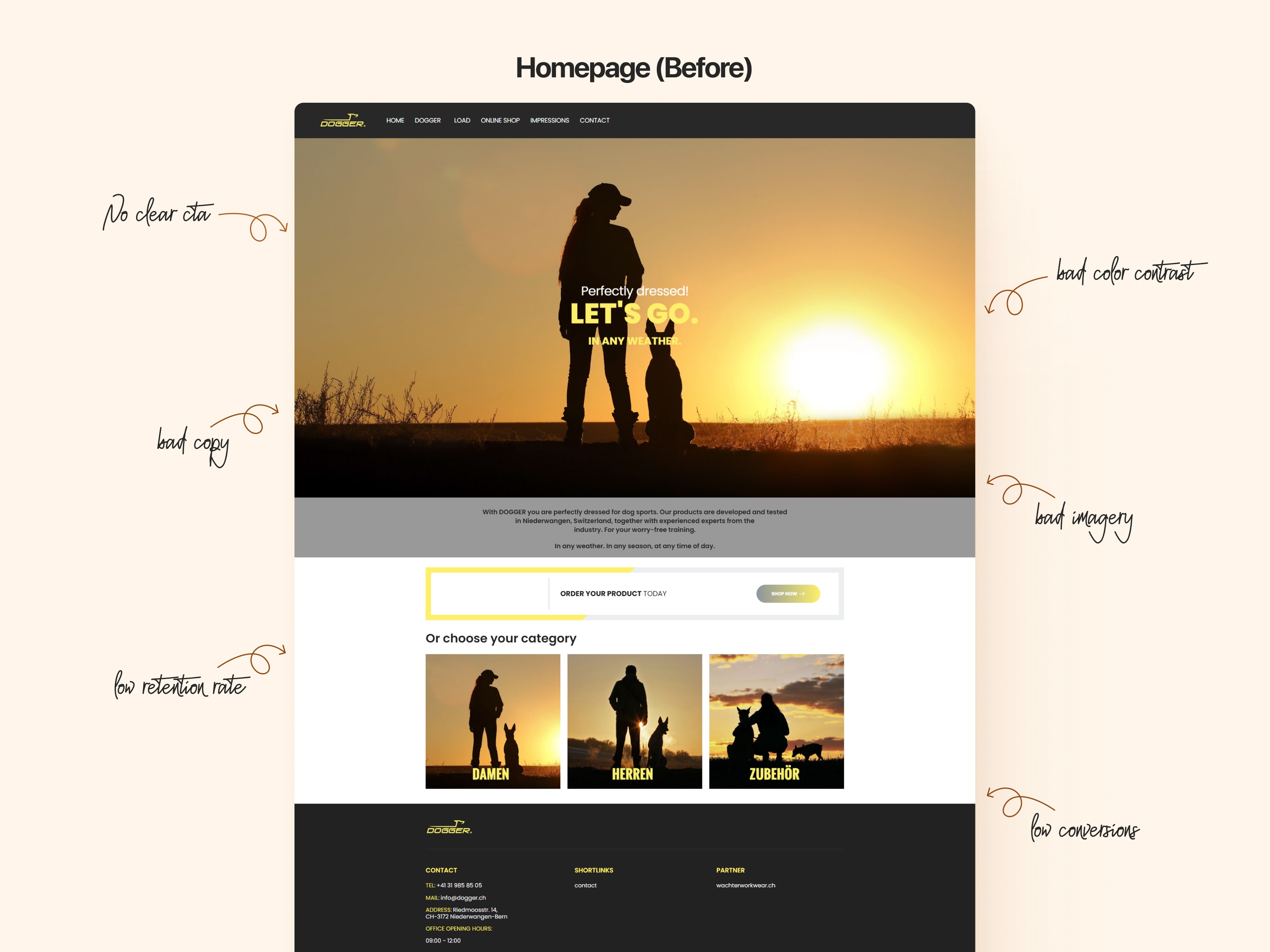
Old Design
Upon analyzing the existing website, several pain points emerged, each of which hindered both user experience (UX) and conversion rates. Key areas of concern included:
01
Problems
Unclear Call-to-Actions (CTAs): There was no clear indication of where users should go next. The CTAs were either absent, hidden, or did not effectively communicate the action's purpose.
Poor Visual Hierarchy: The design lacked a clear structure, making it challenging for users to prioritize information. Essential content was buried, and the pages did not guide the user’s eye intuitively.
Color Contrast and Accessibility: Many parts of the site suffered from insufficient contrast, impacting readability and accessibility for users with visual impairments.
Ambiguous Copy and Messaging: The content did not clearly convey the brand’s focus on dog training apparel, resulting in user confusion and low conversion.
Low Usability in the Checkout Flow: The existing checkout process was lengthy and unintuitive, leading to high cart abandonment rates.
02
Redesign Goals
The primary objective of the redesign was to address the identified usability issues and create an intuitive, user-centered design that would improve engagement and conversions. Specific goals included:
Enhancing CTA Visibility and Placement for improved user navigation and conversion.
Improving Visual Hierarchy and Layout to guide users naturally through the website.
Ensuring Accessibility by increasing color contrast and adhering to WCAG guidelines.
Streamlining the Checkout Process to reduce friction and boost completion rates.
Refining the Brand Messaging to clearly communicate Dooger’s value proposition.
03
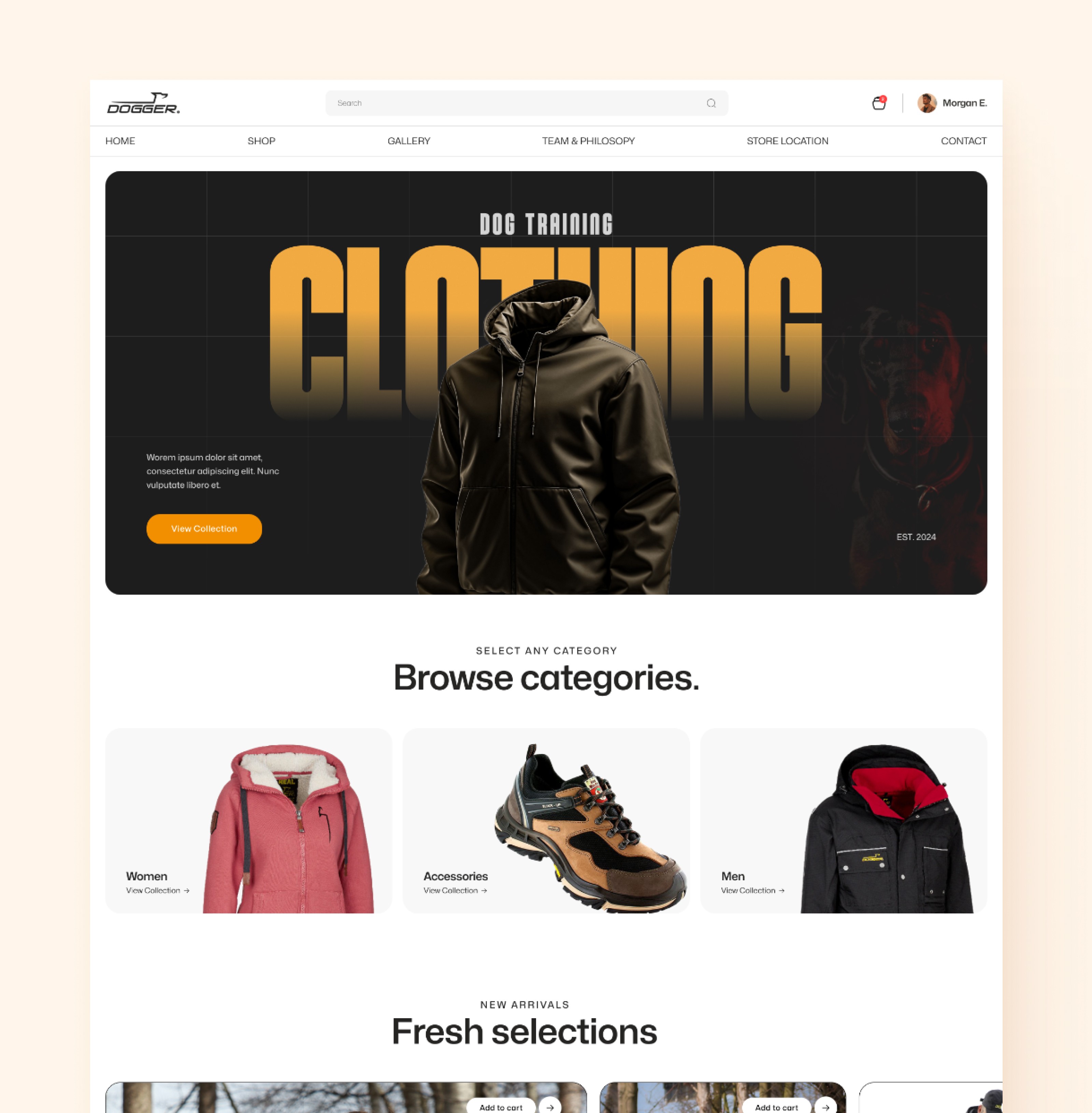
Designs
Let's give a sneak peak into some of the important pages of new design
Home with clear CTas
Checkout & Contact


Payment for a session


06
Results and Impact
The redesigned website was measured against several KPIs (Key Performance Indicators) to quantify the improvements and assess the effectiveness of our changes. The results post-redesign included:
Increased Conversion Rate by 35%: The improved CTAs and streamlined checkout process resulted in a significant uplift in conversions.
Reduced Bounce Rate by 10%: A clearer layout, defined hierarchy, and improved accessibility helped retain users longer and kept them engaged with the content.
Higher Retention Rate by 10%: Users returned to the website at a higher rate due to improved navigation, brand messaging, and an overall user-friendly experience.
Improved User Satisfaction (via Usability Testing): Usability testing showed a marked improvement in user satisfaction, with a score increase of 60% from pre-redesign scores. Test participants noted a more intuitive experience and clear pathways from browsing to purchasing.